DESIGN, Development,
DIGITAL MARKETING
IHS
This is digital space specifically created for those who have had one of the most underestimated workplace injuries, hearing loss. The company operates on two opposite sides of the world and offers assistance as IHS (Industrial Hearing Services) in Australia.
Summary
The idea behind having a digital spot open for information about industrial hearing loss was to reach wider audiences and raise awareness of the potential consequences of noise exposure. With IHS websites, workers in Australia, as well as those across the globe, can seek information about the risk factors, prevention methods, steps to take once the damage is done, as well as information about their rights and entitlements. The goal is not to place blame, but simply inform and protect those who have been involved in one of many industries with increased risk factors.

Branding
IHS logo uses a combination mark, though once again, simple in form. It consists of a lettermark with an addition of a brandmark depicting a soundwave. The goal was to give out a clue on what the business may be about on the first glance.
The specific color scheme was used to relay the following traits of the brand reliable, caring, open for communication, and professional. The choice was narrowed down to subtle blue, orange, and white. The blue shows the confidence of the brand that it can provide reliable information, educate, and deal with any processes in a structural, professional manner. Orange, on the other hand, is there to show that this business is about the people it is trying to assist. Their issue is recognized as a serious one and it is being treated that way. The business is driven by people who are full of understanding of what their audiences might be going through, and they have a warm way of handling it.
Blue
RGB (41, 77, 127)
Orange
RGB (237, 135, 45)
White
rgb (255, 255, 255)
Development
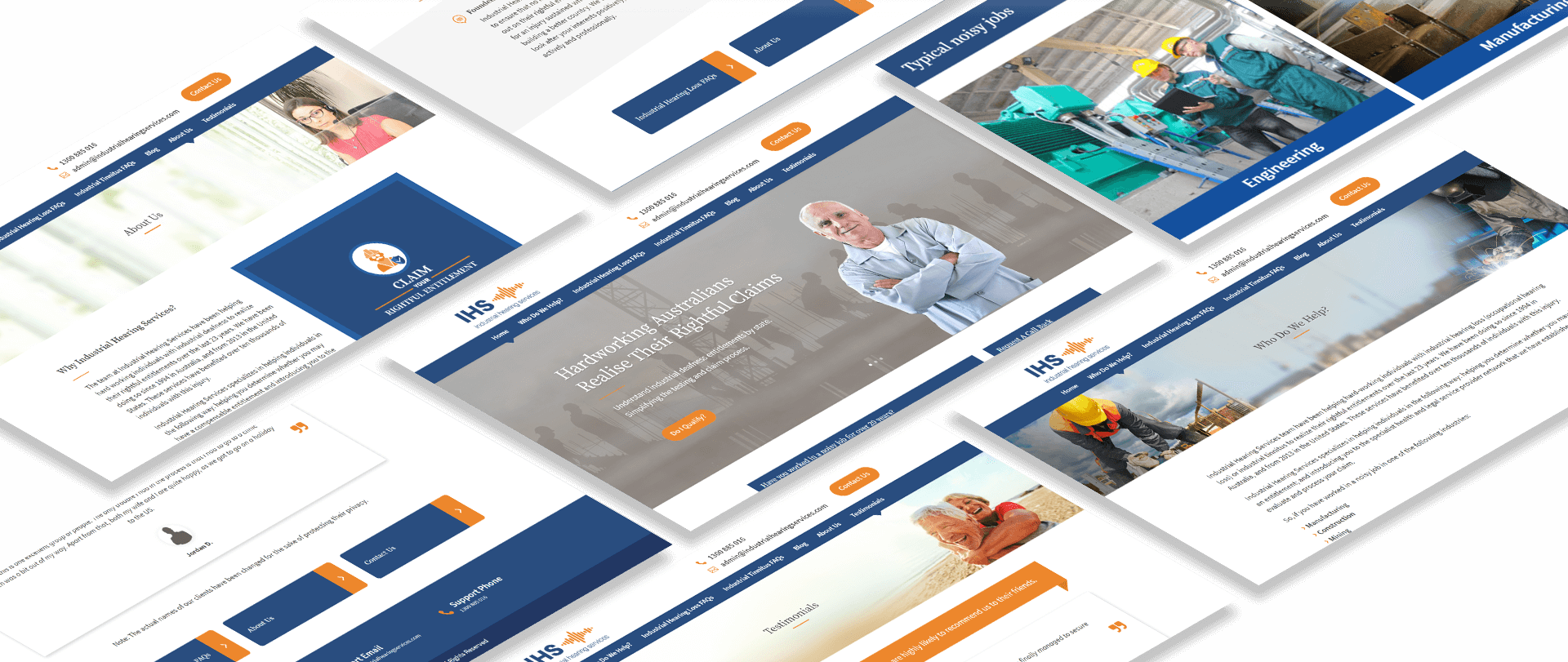
The websites were built with their future users in mind. Looking at the nature of the issue it is covering, it is safe to assume that most of the visitors have been in the industry for a number of years, and potentially belong to a generation which had accepted digital era at a later point in their lives. To focus on user experience, we opted for simplicity in organization, clear and easily readable messages, and straightforward menus. Navigation is made easy and one can always go quickly back to where they initially were.

Homepage
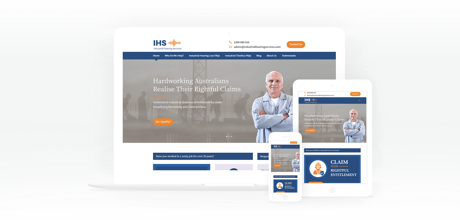
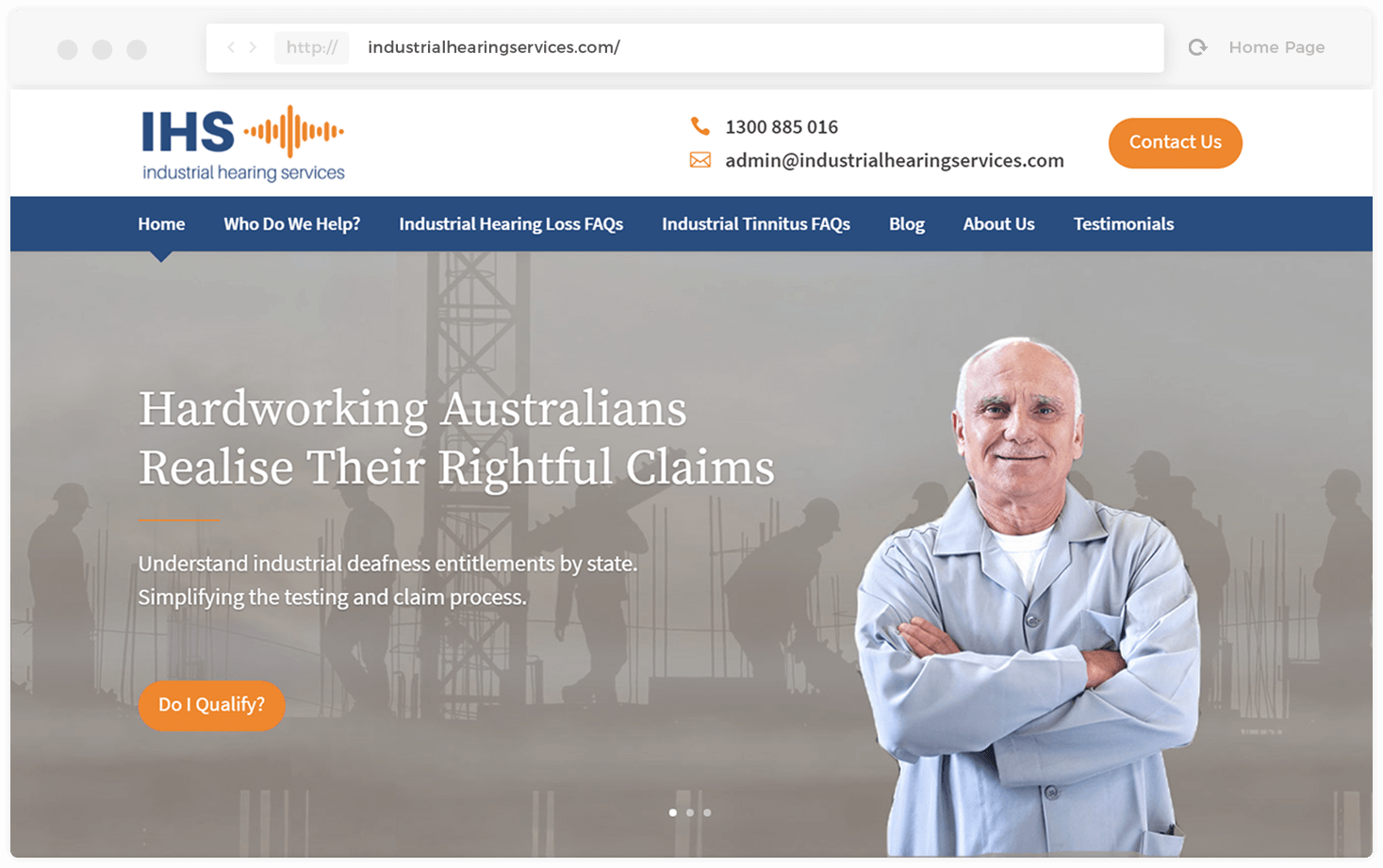
Home Page has the most important information outlined. By the very first glance, a visitor will be able to tell who the services are for and what they involve. They can find ways of reaching out, find out the steps of the claiming process, and get answers to some of the burning issues.
It answers questions Who? What? and How? as well as “Do I?” and many others.
Apart from providing contact information, the website offers two features we found the visitors would appreciate. The first one is a request for a call back which has zero impact on a phone bill, accompanied by a short form designed to request a quick feedback on whether basic qualification criteria for compensation are met. Each page of the website focuses on clear visibility and simple navigation as a part of user experience.

Target Audience
The needs of the target audience (in this case – website visitors) are determined based on customer profiling and three model customer personas based on analysis of customer profiles. Three customer profiles were determined and a special targeting strategy was being developed as the most of the direct audience was 60+.

Digital Marketing Strategies
We focused digital marketing on increasing organic traffic, as well as traffic achieved through PPC and equally importantly, decreasing bounce rate which was significantly higher than those of the competition. We have set a 6-month objective to increase the websites MOZ rerate and achieve more traffic. This was done through a carefully designed content strategy, a social media campaign, work on the content SEO and UX to lower the bounce rate and working with the business to focus on targeted offers, keywords, and CTAs related to those offers.
The initial goal was to generate 15% of target lead volume through the above-mentioned strategies within 6 months, with an expected increase of another 5% (total 20%) within the subsequent 6 months. The target volume was to be distributed across the following channels:
10% PPC search and display
1% email campaign
1% email communication to leads which did not convert
3% the combination of the first two channels
The second goal was to achieve top SERP positions for a local search of the selected keyword.
The third and the last goal of the strategy involved social media. The goal was to drive greater word of mouth through social engagement measured in the number of Facebook likes, G+ followers, and retweets. The social was to represent 20% of all website traffic.